
What brought about this collection?
I moved to Jamaica and I had a whole bunch of time to try to figure out what projects I wanted to do in the midst of waiting for my studio to be built and my supplies to get here. I had all these notions coming here of things I wanted to do and as I started settling in I realized that I needed to find something that was a symbol of me being here. I realized I needed to do a Jamaican centric collection. I was looking for symbols within Jamaica that could symbolize the creative freedom I moved to Jamaica to find. I identified with the dancehall culture and was attracted to the visual style of the fashion. Dancehall fashion has a distinctly Jamaican aesthetic and a freedom. That and I didn't see anyone completely exploring it before.
Speaking of moving to Jamaica, what prompted the move?
I needed a transition. I felt trapped in New York. Trapped by its inescapable ways of casually pick-pocketing hours from your day. I was working full time and trying to be a full time artist. There ain’t enough time in this city for that. had been in a corporate environment for awhile and I was doing artwork at night time. I had all this energy bottled up in me. I felt like if I didn't make a move now I was going to explode. I needed something that would allow me to transition into a full time creative lifestyle. I felt like in order to do that I needed to completely wipe clear everything that I was before. I just wanted a clean break with a new environment that would refresh my creative energy because I believe that there are environmental restraints that force you to operate and behave in a certain way. Sometimes when you remove those you get to see a different side of yourself emerge or be uncovered. Jamaica seemed to be the perfect setting for a lot of different reasons. It allowed me to have an affordable lifestyle, less distractions, get closer to my roots and the timing was just right. The stars aligned. I had to try not to think too much about the fear part and just do it. When I came to Jamaica I got to wash myself clean of the restraints of New York and America and I think changing settings and environments has allowed me to be my truer self.
So this collection is pretty significant to you as an artist, did it achieve what you wanted to with it?
Absolutely. This collection is very personal for me. I want every piece of work that I do to be a part of a growing conversation of who I am as an artist. I have never been trained as an artist so this was a way for me to have deliberate practice. I almost felt like I was putting myself through an artist residency in Jamaica where I had a set of projects I had to do that was related to the place. I could learn, practice and develop my skills as an artist. I challenged myself on technique, scale and the time it takes me to complete a collection.
I’m very proud of the reality I was able to make from my vision, and my confidence as an oil painter is on a whole other level now. This has been a nice representation of me growing as an artist and I think it will enable me to do bigger and better work in the future.
Were there any challenges that you faced along the way?
When you start painting every brush stroke can be a scary thing because you know what you want a piece to look like, but you don't want to make a mess and do the wrong thing or make something that looks terrible. Because this was the first time I was painting in this style it was a challenge to have faith in myself. It's just about perseverance of coming in every day. Most of my journey this year has been internal. It's been about understanding who I am and what makes me tick, what keeps me motivated, what I'm fearful of, etc. It's been a freeing of myself to see myself in a whole new light. I had to practice that on a daily basis. There were also a lot of logistical issues. Like you can't go on the internet and type "how to paint black skin." You can find tons of stuff on how to paint white skin or whatever, but there's nothing for there for dark, colored skin tones. It was just another example where there seems to be no history of painting people of color. You just gotta figure it out on your own. I was also constantly mixing colors to match the outfits and if the paint dried I would have to remix and find a way for it to match back. It was a constant challenge of being able to replicate a color based on what you see in the image and what you've already painted.
How did you select the subjects?
I worked with Marlon Reid at Kingston style. He had a catalog of dancehall photos from the last three or four years that I went through with my wife. We tried to find characters that were diverse. We didn't want to use the same character for each piece. We wanted people that felt like they could command a stage. Their photo had to commanded our attention just by their presence through their style and fashion. I also didn't want any basic style, someone who looked like they just went to the store and bought an outfit. I wanted to see something that had a specific charisma and uniqueness that is the dancehall. A mix of unique and bold colors. Someone that you realize is dressed this way because they want to make a statement, not just audacious but curated.
Do you have a favorite?
There are two. One is the guy in the green. The color is really strong especially with the contrast between the grey and the green. There is also something about his stance. I feel like he captures the attention that he wants. I really love his clothes and the way I painted the pants and jacket and there is a lot of detail in his belt. As you get closer to it you realize there are a lot more elements to it and I feel it was executed really well. There is a lot in there that I am proud of. The one with the three guys is also one of my favorites because everyone has their crew and when you see that crew you feel like there is something special about it. I love seeing a collective of people where everyone has their own unique style but they're all coming from the same mindset, especially with black people. I also liked that there's some hip hop vibes mixed in with the chains and the Timbs.
What do you think your subjects are trying to express?
I think it's a power play. I don't think they are dressing like this at all times. It's reserved for this space. I think woman and disenfranchised people in general feel like the dancehall is an opportunity for them to get rid of the things that are associated with their status in everyday society and create their own statement. The dancehall is the common person's stage. It's a place they can go and propel themselves into the limelight through fashion, or beats or dance. They are getting photographed, people are looking at them, people are admiring them. It's a temporary space and time when they are on stage and the light is shining on them and they have the power. When the party is over everything goes back to normal and life is just whatever it was.
Is that why you call this collection freedom of expression?
That is what attracted me to the dancehall scene. I feel like it's this space within Jamaican culture where people come to be free to express themselves. They are free to be bold, proactive, dance how they want, listen to music how they want, and just express themselves however they want. That's what's so attractive about the dancehall scene in general. There is something completely empowering and alluring about a space where people can be free and be completely who they want to be.
So what's next for this collection?
I’m so happy that a piece from this collection has been chosen for the National Gallery of Jamaica’s Biennial program this year because this collection is historical. It will mean more as time goes by. It's a time capsule. If you take these pieces and look back in 20 years you won't be just looking at the context of Jamaica in this current moment. There's a conversation that comes with it about what is Jamaica, what is dancehall, what does all this mean to the moment and time. Beyond that if you're interested on a larger level in black culture across the world then this is part of that conversation. The thread of being black and of the slave trade is between all of us but there are just geographical nuances that affect the way we live. When you explore what it means to be black in this world Jamaica is a big part of that because it's so culturally rich and has spread across the world. This collection isn't quite done because as I was creating it I realized I want to further explore the visual language of fashion and style of black people from across the world. It opened up my mind to the story that is revealed around the circumstances of Jamaica, dancehall and what these people are looking for in their style and I want to see what other stories can emerge from the same exploration. Places like New York and Nigeria that also have scenes that are on the cusp of mainstream. I want to continue to explore fashion and style through the lense of how black people express themselves across different spaces.
What’s next for Andre Woolery Art?
I’m going to continue to celebrate black culture and the black experience with my art.
THE TITLE..."INVISIBLE HIEROGLYPHICS"
Hieroglyphics is a system of writing that serves as a form of communication. They represent an imprint of the world as it was told in the past for the future to decipher and understand. These writings are a window into another world. Today, the touchscreen interface is our window into another world and the writings are smudged onto the screen instead of carved into stone. Its subtle, but if you strip away the hardware and software, what’s left is a finger painting that illustrates the story of how we communicate.

THE APPS
We collected a series of apps ranging from daily productivity to social networking and gaming. What we uncovered is a really interesting set of blueprints for interaction. Shout out to all the user experience designers that worked on all these apps…this artwork is as much ours as it is a showcase of their intuitive pathways. The artwork highlights the "blueprints" crafted in the user experience designers of each app that we used.

THE PROCESS
The process was filled with experimentation. We had a concept that we wanted to explore with no notion of what the finished work would like. After a series of trail and error, we developed a process to create the artwork we uncovered:

Capture the fingerprints with a camera.
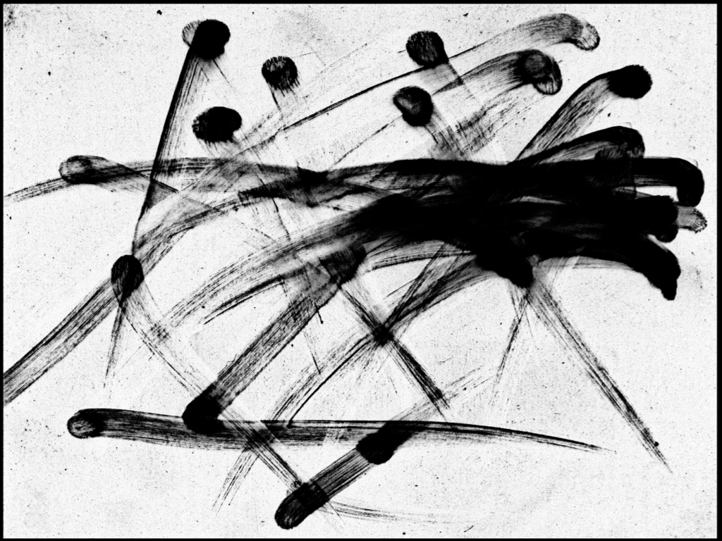
Place the image into Photoshop to manipulate.
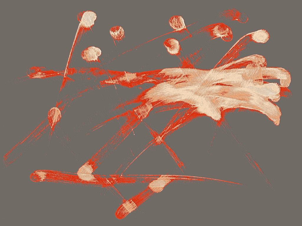
Apply layers of color based on finger pressure.
DIGITAL TO PHYSICAL
The images on artwork offer no justice to its physical presence. The colors are vibrantly portrayed on satin paper that is placed between a white backing and 1/4” acrylic glass. The acrylic glass gives this piece incredible luminosity and optical depth that mimics an actual screen. We wanted to finished work to feel like the screen that it was lifted from. This is the very first print that was executed correctly after several rounds of figuring out the best way to make this come to life.

THE ARTWORK
Each piece has three versions; Black and White, Color on Black, and Polychrome: